Our church has been pretty strict on safety requirements all through this COVID-19 pandemic. We have been following state and county regulations as well as mandates and recommendations from the CDC. During the full lockdown, we developed our ability to conduct church business online. When the lockdown was over, our re-opening was strict—facemasks required, social distancing, sign-ins for contact tracing, no singing of hymns, and limited total attendance in the building. These limits are especially painful during what are usually large events such as Christmas, Easter, weddings and funerals. The restrictions on funerals and memorial services have hit especially hard.
That is why so many members were relieved this past summer when we were finally able to conduct a good-sized memorial service on a rain-free Saturday outside under a tent. Just this week, though, the Session, our church’s governing body, turned down a request for a similar memorial service for a well-loved longtime member of our choir.
A lot of church members were upset. Why was a large memorial service OK in early July but not in September? Why the reversal? It made little difference to them, or they hadn’t noticed, that our State Department of Health had also changed its rules and that even the CDC had “flip-flopped” on its recommendations for wearing face masks at indoor events.
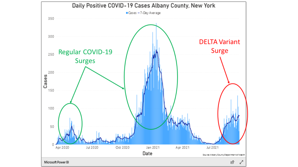
The answer to the question, “Why the flip-flop?” is clearly visible in the data. Figure 1 shows three of the larger surges in new cases of the virus in our county. The current surge, associated with the new Delta variant, is circled in red. We know that the Delta variant is causing this surge because of independent reports on the viral genetics of the people who are being hospitalized and dying. The green circles point to the initial surge in spring 2020 and the major surge in winter 2021. Between the January 2021 surge and this new Delta-driven surge, the pandemic seemed to be subsiding. During this period the vaccines were kicking in and making a huge difference. Around August the Delta variant arrived, and even though more persons continue to be vaccinated, we are now in a whole new ball game. Notice especially that the new Delta variant surge is causing more new cases of COVID-19 than were seen in the first surge in the spring of 2020—a time when we were in lockdown.
Several weeks ago, Ali and Dan began to dig a bit more deeply into these matters. Because Ali’s model is a simulation, they can re-run the simulated pandemic many times asking “what if” questions. They ran three “what if” scenarios. In the first, there were no vaccines. In the no-vaccine scenario the surges continued to repeat for years into the future. In the second scenario, Ali and Dan looked at the effect of introducing a vaccine that was 90% effective and 70% of the population was willing to take it. In this scenario, the pandemic was damped down effectively after two or three smaller cycles. That’s what Albany County looked like in the summer of 2021.
In the third scenario, a new variant of the virus was introduced exogenously between days 450 and 550 of the simulated pandemic. In the real world, the Delta variant started appearing in Albany roughly 500 days after the first cases of the initial surge. In the model, the new variant was twice as infectious as the original, just as the Delta variant is roughly doubly infectious, and the vaccines were only 80% effective in preventing severe illness. Population willingness to take the vaccine remained at 70%. This scenario made a big difference. The pandemic re-erupted, primarily among the unvaccinated population but with some cross-infections to already vaccinated persons. Fortunately for them, the (simulated) vaccinated persons faced only one ninth the risk of getting infected as unvaccinated persons.
To return to our story, the Session reimposed a strict cap on attendance and kept in place the no-singing restriction, along with all our other restrictions – even for a memorial service for a former member of the choir. This is why the request for a second larger memorial service was denied. The decision was based on careful consideration of recent information about COVID-19 in our area and changes in county, state and federal recommendations. So, I guess that we did our own “flip-flop”, just as the government agencies did. The risks of having the new Delta variant push the pandemic back into full surge mode were just too great.
This Story Has a Lesson
The new Delta variant is a game-changer. Projections completed a few months ago anticipating that vaccination levels would soon be high enough to tamp down the pandemic have been upended by the infectivity of this new variant, as reflected in recent data. We are going to be facing this pandemic for a while longer—at least until our vaccination rates get high enough to reach herd immunity.
Read More to Dig Deeper
The recent emergence of the Delta variant is an important development. How Ali and Dan used the model to look at it deserves some attention 1. This note repeats the information that was presented earlier in the Diary entry, “Micah and Habakkuk, the Delta variant, and Ali’s Model” from August 23, 2021 . The model’s equations describe disease dynamics and human countermeasures. We need to take both of these into account to properly describe the dynamics of the pandemic.
The disease dynamics part of the model builds on standard epidemiological theory of how infections spread in human populations. Referred to as SEIR models, they divide the population into discrete compartments such as Susceptible, Exposed, Infected, and Recovered. Knowing specific biological parameters for a given disease is the key to developing these biology-based models. Important parameters would be factors such as average duration of infection, average duration of immunity post recovery, the average number of contacts per day of one susceptible person with other infected persons, and the probability of transmission per contact.
SEIR models capitalize on the fact that important biological forces are connected in feedback loops. For example, the number of daily infections accumulate to create a stock of infected persons. In turn, the number of infected persons on any given day drives a computation of the number of contacts between infected and susceptible persons, which in turn leads back to the daily number of infections in the next day, completing the loop. Circular computations in Ali’s model mimic the circular causation of disease in the real world.
Importantly, the model also contains equations that mimic human countermeasures such as decreasing daily contacts (aka, social distancing), decreasing the probability of contagion (mask wearing), testing and quarantine protocols, government mandates, reallocating hospital capacity, and most importantly, vaccination programs of varying effectiveness with varying participation rates.
Ali has created a short ten-minute video that describes how all these effects have been layered into his model. You can view that video at the following URL: Technical Details for Ali’s model. Similarly, Dan has created a video that discusses how all the disease and countermeasures represented in Ali’s model combine over time to create a simulated trajectory for one key variable—number of persons infected daily by the pandemic. You can view Dan’s video at the following URL: Behavior of Total Infected in Ali’s model. If you are both curious and motivated enough to dive into all the details, Hyunjung has created a curriculum consisting of several modules that can help you do just that. Completing these modules could take hours of time and effort (and could even earn you 3 college credits 😊). You can view her video at the following URL: Building a System Dynamics Curriculum Based on Ali’s Model.
Ali’s model is not intended to predict the magnitude or timing of the pandemic in any particular region. While some of the base numbers were calibrated to reflect a whole nation the size of Iran, the purpose of the model is to describe and help us understand interactions between disease dynamics and human countermeasures in any region (such as Upstate New York around New Fadum Farm). Hence, his model is a mathematical abstraction that leaves out some important factors: it doesn’t break out the population by gender or age group; there are no social networks in our populations; there are no winter or summer seasons in this model; schools do not come into session in the fall or release for summer breaks 2. Time in this model doesn’t correspond to any particular calendar dates. Rather it just starts at an arbitrary day zero – the day of the first infection.
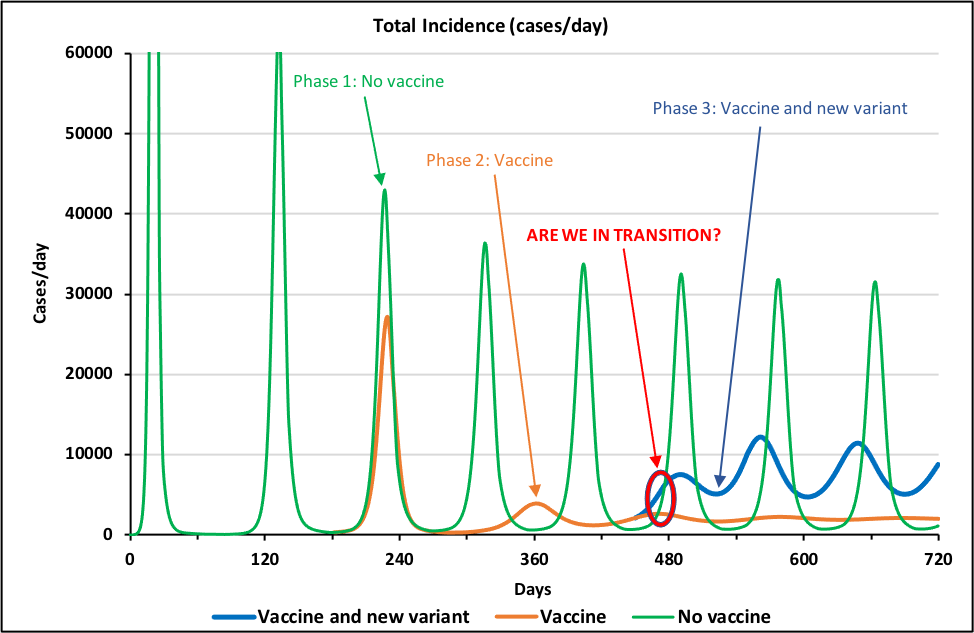
Phase 1: Original COVID-19 pandemic. All three phases of the pandemic show identical dynamics for the first 200 days and hence the green, brown, and blue lines print out on top of each other, looking like a single green line. The first scenario (“No vaccine” – green line in Figure 3) shows what would happen if there were no vaccines and no Delta variant. The line shows that the pandemic has a distinctive pattern of recurring surges that are spaced about 4 months apart. The surges occur because of the continuing interactions between disease dynamics and human countermeasures. In the model, as deaths rise above some threshold, the human population becomes cautious and implements an array of countermeasures. When these succeed in reducing the infection rate, the population relaxes its vigilance. The virus, however, is still present in the population, so a new wave of infections commences.
Ali’s model does not allow for any long-term learning by the human population, so surges continue on and on, easily for a decade or more. Looking a human behavior over the first two years of the real-world pandemic, we might indeed conclude that, alas, the assumption of no long-term learning is not all that unrealistic.
Phase 2: 70% Willingness to Vaccinate Suppresses Original Pandemic. All the dynamics of the repeating surges in the green line in Figure 3 are created within (or endogenous to) the interactions of disease dynamics and human countermeasures. At day 180, the vaccine roll-out begins. The roll-out is external to (or exogenous from) the internal dynamics of the pandemic; in other words, we – the modelers – specify before the run even starts that it will start at that time. The brown curve (“Vaccine”) in Figure 3 shows the results of a vaccine that is 90% effective, with 70% of the population willing to take it. It takes about 3 cycles to damp out the surges, but by day 720 the pandemic has flattened out to a stable infection rate that no longer surges. At that point the population is on the edge of herd immunity.
Phase 3: Delta Variant Recreates Original Pattern of Recurring Surges. The second external force that Dan and Ali have inserted into the model is the emergence of a new variant of the virus, similar to the Delta variant. They changed the model so that between days 450 and 550, vaccine effectiveness declines from 90% to 80% and the relative infectiousness of the virus doubles. Changing these two parameters shifts model away from herd immunity. The result is that infections, which had been moving toward a stable, low level, start oscillating again (“Vaccine and new variant” – blue line in Figure 3.) Interestingly, the oscillations of the blue line are as persistent as those in the green line. Furthermore, even though the green line’s oscillations are larger than the blue line’s and its peaks are higher, its troughs are lower, so that the total number of persons infected in each wave (i.e., the area under the curve) is about the same in the blue and green curves. Does that mean that the vaccination program has failed with regard to the new variant? Not at all – without 70% of the population being vaccinated with an 80% effective vaccine the toll from the new variant would be much, much higher.
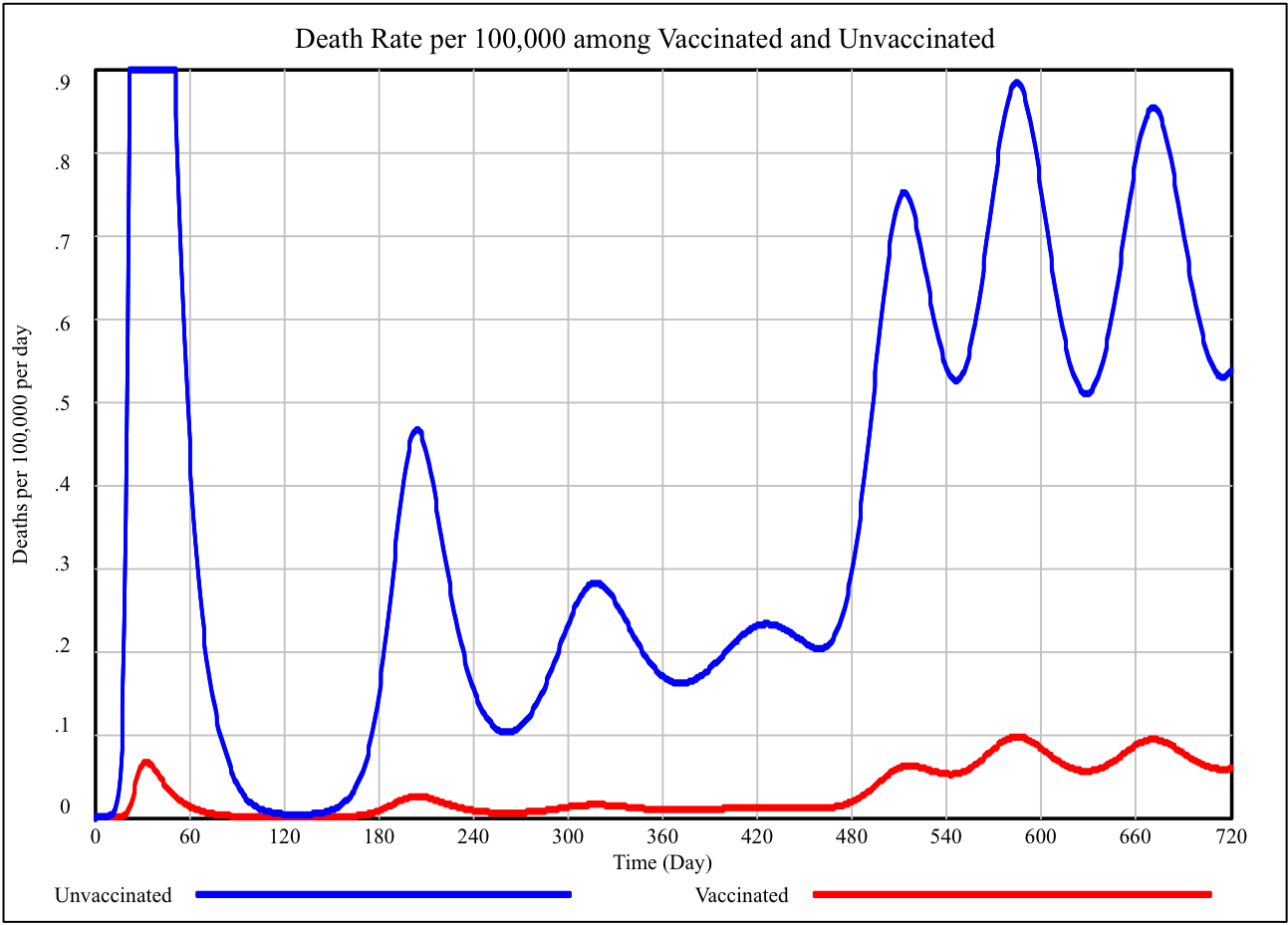
Fortunately for vaccinated persons, the surges occur mostly within the 30% of the population that is unvaccinated. Figure 4 illustrates this effect. The blue line is the death rate per 100,000 for unvaccinated persons over the same 720-day simulation. The red line shows the rate for vaccinated persons. (Obviously, before anyone is vaccinated, this rate is zero.) There are still serious illness and deaths among the vaccinated, but the rate is much lower than among the unvaccinated.
In Figure 3 there is a red donut, “0”, around the blue and brown lines at about day 480. To a person living in Ali’s model world, 480 days into the pandemic would be a confusing time. The vaccines started to come in at day 180 and the shift to the new variant began at day 450. So, the uptick in infections seen at day 480 could be a final not-yet-damped-out surge left over from the original green-line infection as the vaccinations are taking effect, or it could be the beginning of a new phase in the epidemic. In the first case, all the surges would be dying out. In the second case, the surges are coming back strong for a much longer term. We live outside the simulation world, so we know the answer—the surges are coming back strong for a much longer term. Of course we know precisely all the “what if” conditions. Knowing all the facts is not so easy in the real world.
By the way, it has been one year and six months since we started to write these stories. That is 480 days3.
Lastly, this 50th story out of the “Diaries During (and After) Lockdown” project is not just about a technical model and its results. It also includes an important digression about Micha and Habakkuk. What’s that all about? Here at New Fadum Farm, we believe that making sense of the pandemic requires solid data and good science, but it also requires a moral compass. Knowing how to behave in these times doesn’t emerge just from data and science. We could understand the science perfectly well and use it just for our own benefit, ignoring our community.
Our team here at the New Fadum Farm project derives our individual and moral compass from a mix, different for each one of us, of our individual religions and from secular ethical reasoning about social justice. This is important stuff. Some of our stories are set in the context of decisions that needed to be made by church members. We emphasize that the same considerations arise in our decisions about scout troops, little league, 4-H clubs, or family gatherings.
Viewing decisions about how to conduct ourselves through a lens of what seems best for ourselves individually (such as asserting that the decision to get vaccinated is a purely a matter of “personal choice”) will not work in this time of pandemic. Correct decision-making requires a moral and ethical compass that includes concern for the many. No one can truly be fully safe until all of us are. We believe this is both a scientifically and a moral truth.
Footnotes
- This note repeats the information that was presented earlier in the Diary entry, “Micah and Habakkuk, the Delta variant, and Ali’s Model” from August 23, 2021.
- These more generic models, such as Ali’s model, stand in contrast to a class of models that are carefully calibrated against detailed time series data For one example of such a model of the COVID-19 pandemic calibrated to multiple time series for 92 countries, see: Rahmandad, H., Lim, TY., Sterman, J., “Behavioral Dynamics of COVID-19: Estimating Under-Reporting, Multiple Waves, and Adherence Fatigue Across 92 Nations”, System Dynamics Review, Forthcoming, Available at SSRN: https://ssrn.com/abstract=3635047 or http://dx.doi.org/10.2139/ssrn.3635047
- The timing of the uptick in infections at 480 days is controlled by the timing of the start of the vaccination program (day 180) and the timing of the onset of the Delta variant (between days 450 and 550). Both timing effects were modeler’s decisions based on our casual observations of how things are going here at New Fadum Farm, not independently and precisely measured events in the real world.